
Your website gets traffic. The analytics prove it. What it doesn’t get is enquiries, and nobody on your team can say exactly why.
Most of the time, the answer isn’t one dramatic failure. It’s a handful of common website mistakes costing leads quietly, on every page, to every visitor, whether anyone notices or not. Here are the seven that show up most often, plus one newer mistake most website audits still miss entirely.
Mistake 1: You’re Losing Visitors Before They See Anything
If your site takes more than three seconds to load, you’ve already lost over half your mobile visitors before they’ve read a single word. Page load speed is the single most common technical cause behind the website mistakes costing leads on this list, because it affects every visitor before anything else on the page gets a chance to work.
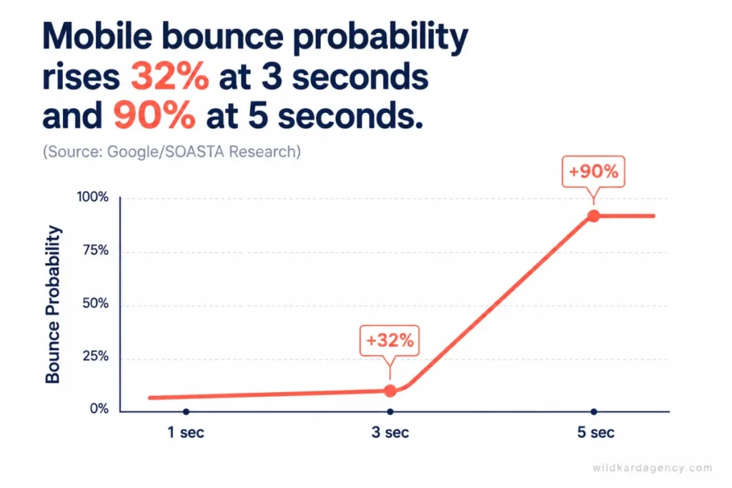
Research from Google and SOASTA found that as page load time goes from one second to three seconds, the probability of a mobile visitor bouncing increases 32%. Push that to five seconds, and the increase jumps to 90%. Every extra second is a visitor who never saw your offer, your proof, or your call to action.
This is usually a technical fix, not a redesign: unoptimized images, bloated plugins, and unnecessary scripts are the most common culprits. It’s also one of the fastest wins on this list, because unlike copy or trust signals, speed is almost entirely within your developer’s control.
Mistake 2: Your Site Isn’t Actually Built for Mobile
Most website traffic today arrives on a phone. Most website mistakes still get caught on a desktop screen, because that’s what the team building the site is looking at. A genuinely mobile-friendly website gets tested on an actual phone, not just resized in a browser window.
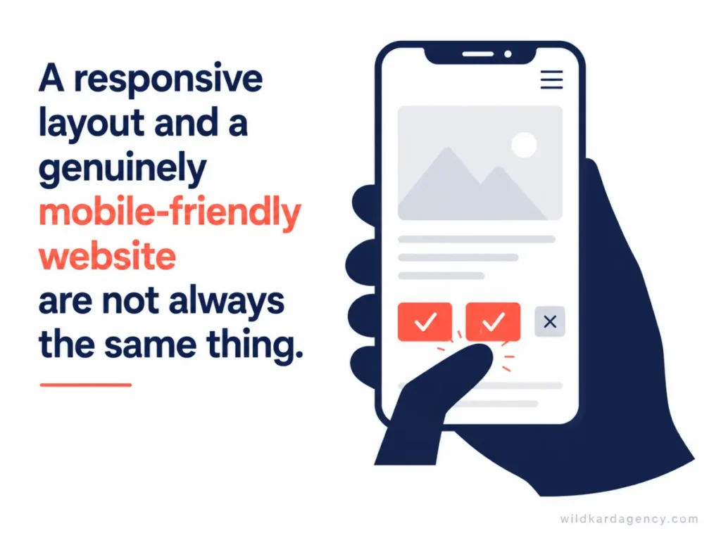
A site that’s technically “responsive” can still fail on mobile in ways that cost leads: buttons too small to tap accurately, forms that require zooming, text that wraps awkwardly, and navigation menus that cover the entire screen. None of these show up unless someone actually tests the site on a phone, in one hand, the way a real visitor will.
Mistake 3: Your Contact Form Asks for Too Much, Too Soon
Every field on a form is a small decision a visitor has to make. Add enough of them, and some visitors decide it’s not worth finishing.
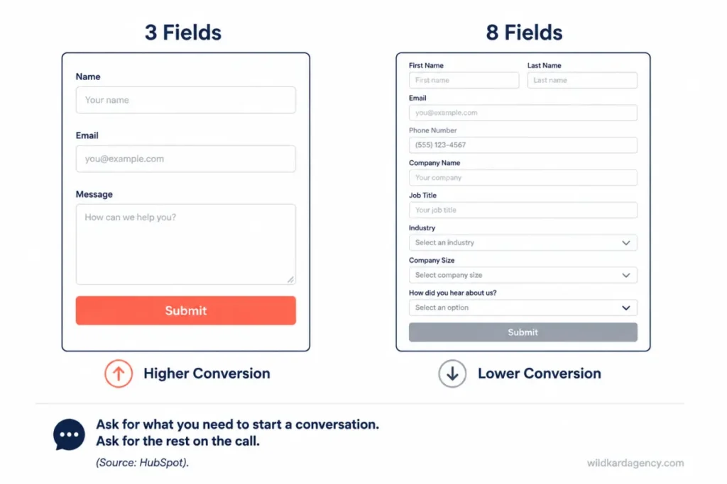
An analysis by HubSpot of more than 40,000 landing pages found that conversion rates decline as form field count increases, and that the drop is sharper for multi-line text fields and dropdown menus than for simple single-line fields. A form asking for name, email, and what they need converts more people than one that also wants phone number, company size, budget, and how they heard about you, all before the first conversation happens.
Ask for what you need to start a conversation. Ask for everything else on the call. Form friction alone can be enough to explain a weak website conversion rate even when traffic and messaging are both working fine.
Mistake 4: There’s Nothing on the Page That Says This Is a Real Business
Trust is invisible when it’s there and glaring when it’s missing. A visitor deciding whether to hand over their contact information is quietly scanning for proof that a real, competent business is on the other end.
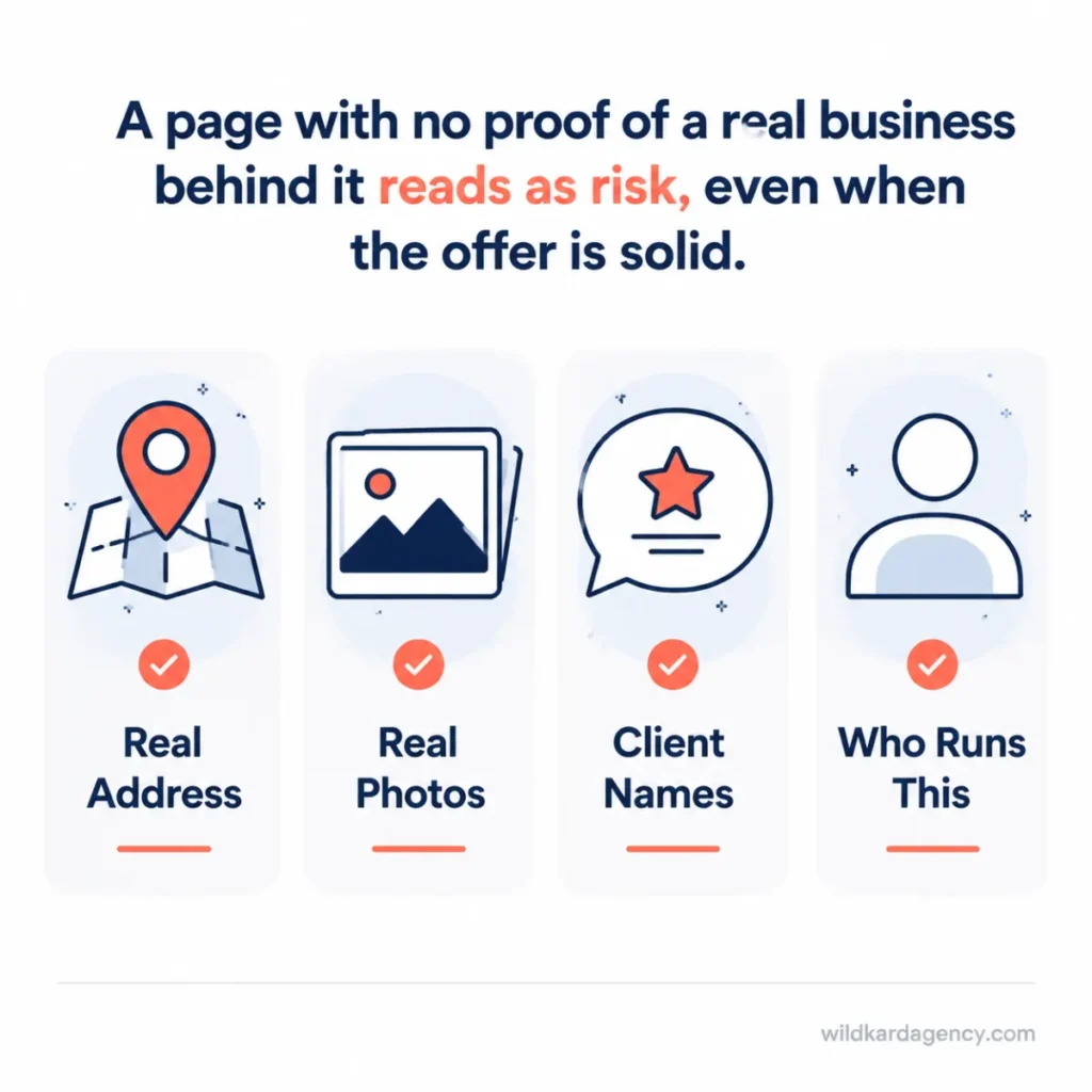
Research from the Baymard Institute found that 19% of users have abandoned a purchase specifically because they didn’t trust the site with their information. For a lead-generation site, the same instinct applies to a contact form as it does to a checkout: a page with no physical address, no real photos, no client names, and no clear “who runs this” signal reads as a risk, even if the offer itself is solid.
This is where a locked, consistent brand identity does double duty. It’s also why traffic without enquiries is so often a trust problem wearing a traffic-shaped disguise.
Mistake 5: Your Call to Action Doesn’t Tell Anyone What Happens Next
“Learn More” and “Submit” are the two most common buttons on the internet, and they’re both a missed opportunity. Neither one tells a visitor what happens if they click.
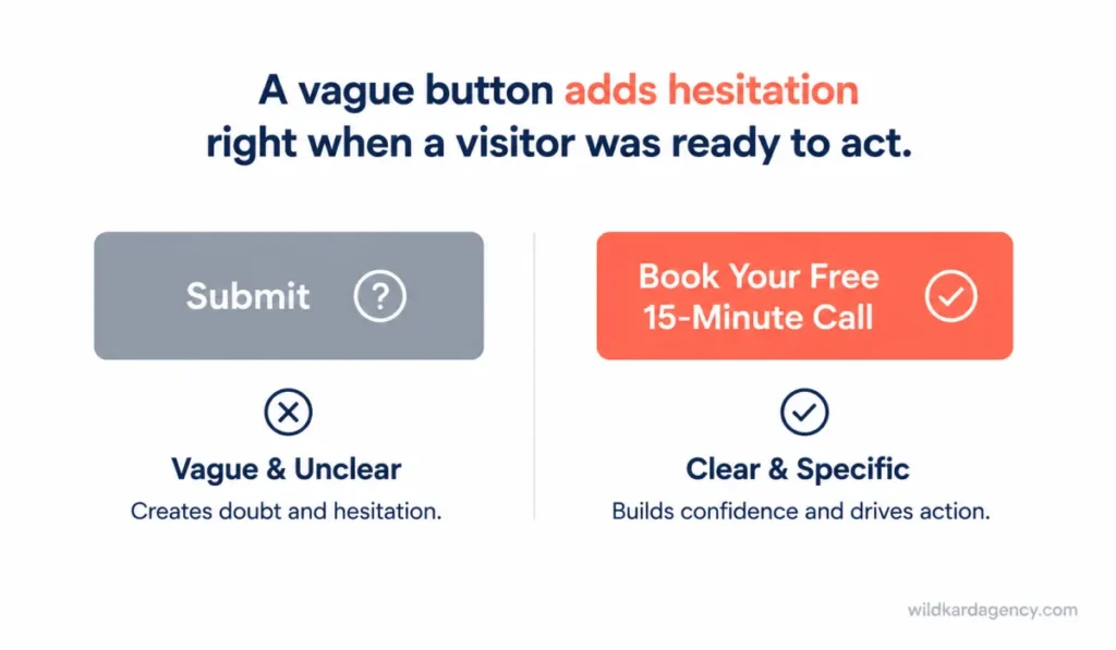
A strong call to action names the action and the outcome: “Book your free 15-minute call” tells a visitor exactly what they’re agreeing to and what they’ll get. A vague button adds one more moment of hesitation right at the point where a visitor was ready to act, and hesitation is where leads are lost.
Mistake 6: Visitors Can’t Find What They Came For
A visitor lands on your site looking for one specific thing: your pricing, your services, proof you’ve done this before, or a way to contact you. If that path takes more than a couple of clicks to find, most visitors won’t go looking for it.
Confusing navigation usually isn’t confusing to the person who built it. It’s confusing to a stranger seeing the site for the first time, which is exactly who a homepage has to work for.
Mistake 7: Your Copy Talks About You, Not Them
“We provide comprehensive solutions for businesses like yours” tells a visitor nothing about their actual problem. Copy that opens with your company, your history, and your mission statement is answering questions nobody asked yet. It’s one of the quieter website mistakes costing leads, because the page still looks finished.
The websites that convert lead with the visitor’s problem, not the business’s pitch. This is the same principle covered in our guide to content marketing for service businesses: buying-stage visitors respond to specific answers to specific problems, not general claims about being comprehensive, innovative, or full-service.
At WildKard, every website audit starts by reading the homepage the way a stranger would: cold, with no context, timing how long it takes to understand what the business does and who it’s for. If that answer takes more than a few seconds to find, the copy is the mistake, not the design.
The Mistake You Can’t See: AI Crawlers Can’t Read Your Site
Here’s the one that doesn’t show up in a Google Analytics dashboard, and the reason it belongs on this list even though it’s not technically one of the original seven.
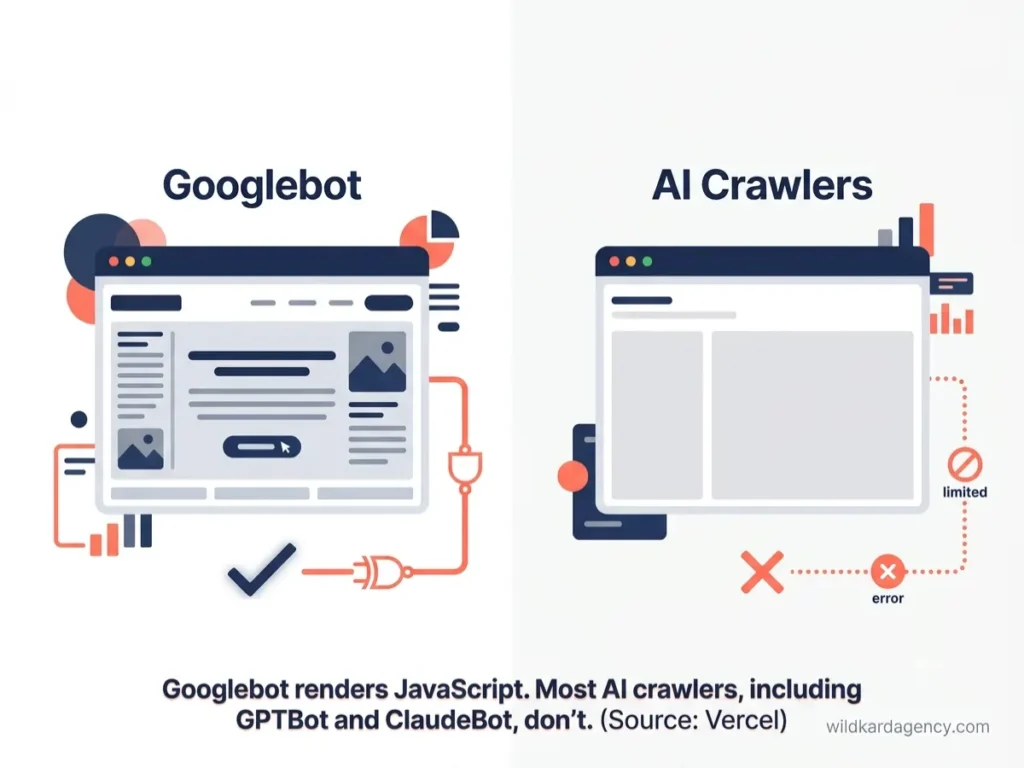
If your website is built as a JavaScript-heavy app, the kind that renders content in the visitor’s browser rather than sending finished HTML from the server, your pages can rank normally on Google while being invisible to the AI systems increasingly sending you traffic. Vercel’s analysis of AI crawler traffic found that major AI crawlers, including GPTBot and ClaudeBot, don’t execute JavaScript. They read the raw HTML your server returns and nothing more. Googlebot renders JavaScript. Almost nothing else does.
This connects directly to the entity-consistency problem covered in our guide to generative engine optimization, and the reason some businesses never show up in ChatGPT results even with strong Google rankings. A site can be losing leads to human visitors for seven fixable reasons, and losing an entirely separate, faster-growing channel to a rendering problem nobody thought to check.
FAQ
Q: Which of these website mistakes costing leads matters most to fix first?
A: Page speed and mobile usability first, because they affect every visitor before anything else on the page has a chance to work. Copy and trust signals matter just as much, but a visitor who bounces in the first three seconds never sees them.
Q: How do I know if my website’s page speed is actually a problem?
A: Run your homepage through Google’s PageSpeed Insights and check your mobile score specifically. Anything consistently loading past three seconds on mobile is losing you visitors before they see your offer.
Q: Can I fix a high-conversion-friction contact form without losing useful lead information?
A: Yes. Ask for name, email, and one qualifying question upfront, then gather budget, timeline, and other details on the discovery call. You lose nothing you actually need and remove the friction that stops people from starting.
Q: Does my website actually need to worry about AI crawlers right now?
A: If your site is built with React, Vue, or a similar JavaScript framework without server-side rendering, yes. Your content may already be invisible to ChatGPT, Claude, and Perplexity even while ranking normally on Google.
Q: How long does it typically take to fix these seven mistakes?
A: Page speed and form fixes are often a one to two week technical project. Copy and trust signal fixes usually take two to four weeks alongside a broader content or brand review, depending on how much of the site needs rework.